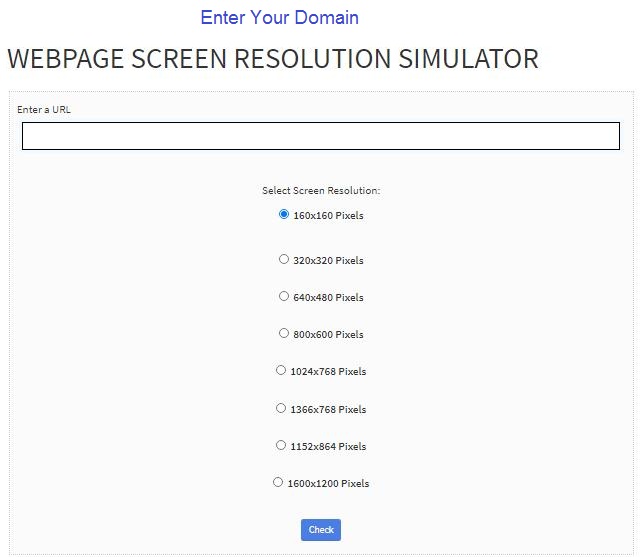
Webpage Screen Resolution Simulator
Enter a URL
Webpage Screen Resolution Simulator
Optimizing the screens suitable for the audience and viewers could be tricky. Businesses have to figure out how to advertise their brands in a way that would seem appealing to the viewers or the audience. If the screen and the resolution are perfect in smartphones, tablets, and desktops, then it would be a go-go for the business to take it ahead on search engine optimization and rankings of the search engine with browser resolution test. Not everyone knows about simulator and screen checking tools, for those who are not aware, here we have discussed a few expert pointers about such effective tools.
What is a Webpage Screen Resolution Simulator?
Screen resolution plays a significant role in maximizing the look and quality of a website with a professional touch. The resolution simulator assists with adjustments of screens on various devices, which is also constant in several formats. Testing the website on every gadget and device to serve a clear and ideal website resolution has become necessary to make it comfortable for the audience. Looking out for every screen resolution in the gadgets can attract more audience and eventually profits. Indeed, visuals speak better than words- if the website appearance is at its best, then your website can be at the peak!
How to use a Webpage screen resolution simulator?
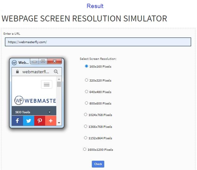
Using a free webpage screen resolution simulator provided by Webmasterfly can be the easiest, only if you have some knowledge about it. Indeed, you need to be an expert, but just the basics would do fine! This sophisticated tool provides comfort and does not demand any individual tasks to use. With the installation of such a simulator, you can instantly check the website’s resolution and even adjust it, if it doesn’t meet the expectations for a specific device. You can merely enter the website link or URL and select the particular screen resolution; of course, you would find pixel and resolution options in the tool.
Once the resolution is fixed, you can also make moderations to website graphics, texts, fonts, layouts, and pages on every screen using tools like screenfly, isn’t that wonderful?
How about we don’t use a simulator?
Yes, you can! A webpage can be checked manually too, but don’t you think that would be tiring? For a large business to look up to the screens operating on every other device and adjust the screen resolution as per the suitability is a tough task and consumes tons of time, who wants to waste our precious hours?
Therefore, businesses, regardless of the capacity and nature of the organization, make use of such simulators and tries their best to put on an appealing website page on our screens. That’s how we save time and money, both!
Conculsion
Entrating more on mobile devices can improve the visitors for the website. Website screen resolution tester can provide a convenient and strainless view for the audience, and that can develop the business and, eventually, the profits. How about trying a screen resolution simulator today?
Screenshot -
- Popular SEO Tools
- Free Grammar Checker
- Free Alexa Rank Checker
- Free Broken Links Checker
- Free Article Rewriter
- Free Plagiarism Checker
- Free Backlink Maker
- Free Google Ping
- Free XML Sitemap Generator
- Free Backlink Checker
- Free Domain Authority Checker
- Free Page Authority Checker
- Free Meta Tag Generator